When you access the "Sales> Analysis" section, the system displays the estimated sales graph up to the last month in which a sales report was uploaded. Keep in mind that sales are updated between the 10th and 20th of each month, and usually have a 60-day lag (some will show up before, depending on the channel). For example, from April 10th to 20th, sales for the month of February will show up.
Therefore, to correctly visualize your sales in the graph, you must indicate the start and end dates with no less than 60 days forecast and click "Reload data".
Important note: Once these sales are confirmed, the amount shown in the graph is no longer estimated but confirmed. In the confirmation process, the amounts may vary slightly, so it may happen that when updating the graph with the confirmed amount you may notice some small modifications in the amounts.
What can I see in the graph?
The system shows the evolution of the estimated sales for each store in a different color. You will see something like this:
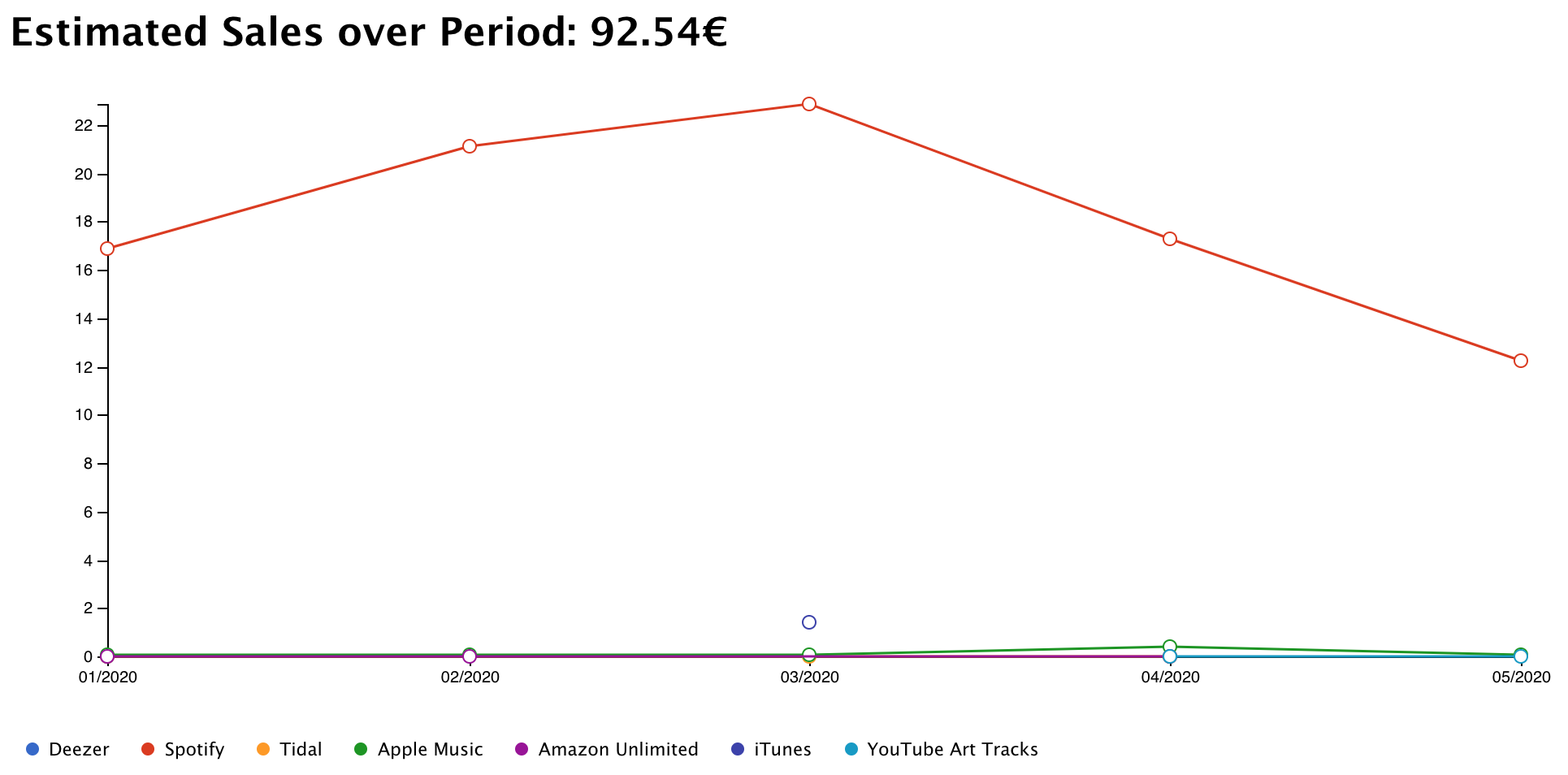
In the bottom part of the graph you may filter the information displayed according to these parameters:
- Date/Period
- Label
- Album
- Track
- Sales channel
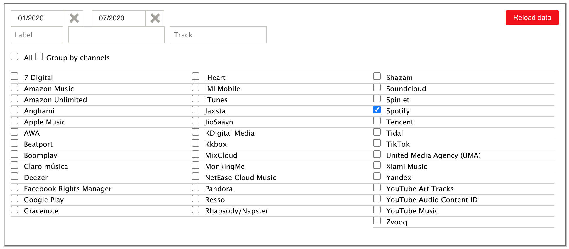
How to filter data with an actual example
To see the estimated sales of an album during the period from 01/2020 to 07/2020 on Spotify, the filter will look like this:
By clicking on "Reload Data" on the graph, you can see the sales during this period according to the criteria selected in the filter.
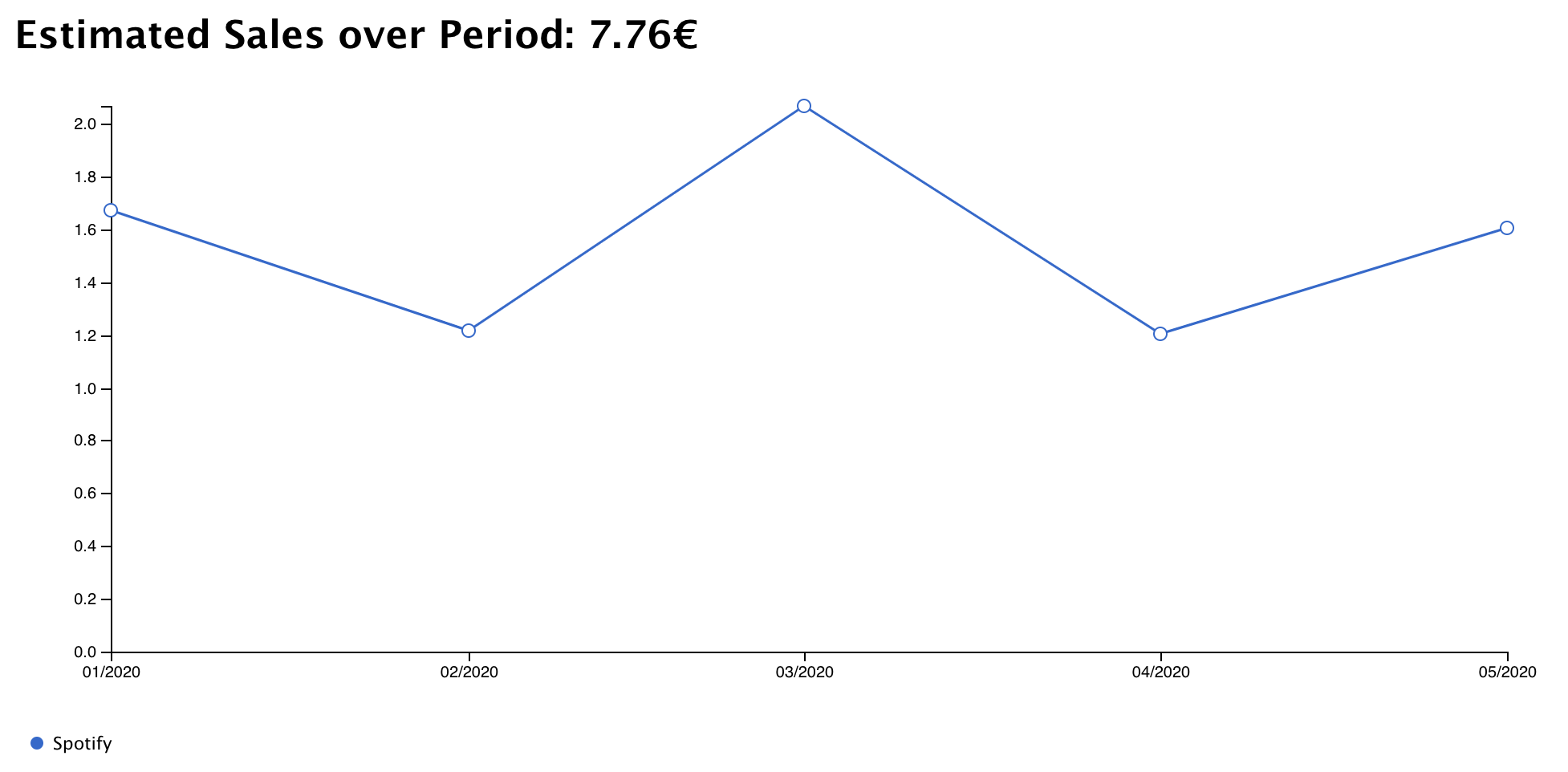
In this example, the sales of the album during the period from 01/2020 to 07/2020 on Spotify were 7.76€.
For Labels:
In order to distribute to different artists the amount that corresponds to each of them, you only have to filter it by artist and then subtract 5%, which corresponds to La Cupula Music's Revenue Share.
Comments
0 comments
Article is closed for comments.